Tag: poetry

  • Ekphrasis as an LDA Network in NodeXL

    Ekphrasis as an LDA Network in NodeXL

    In an earlier post, I mention the value of visualizations as a means for exploring topic modeling data.  That particular example used a small model of 276 poems labeled “ekphrastic” out of a much larger collection.  At that point, I was still struggling with how to read the data, which felt overwhelming.  How could I organize the relationships between topics and documents in such a way as to see salient connections produced by the model?  The intermediate solution was to break the model down into groups of 3 topics and create bar graphs charting the likelihood that each document contained language from each topic.  That solution worked in the short-term, because it helped me to discover the fact that one topic was found highly likely within a particular volume of ekphrastic verse: John Hollander’s The Gazer’s Spirit.

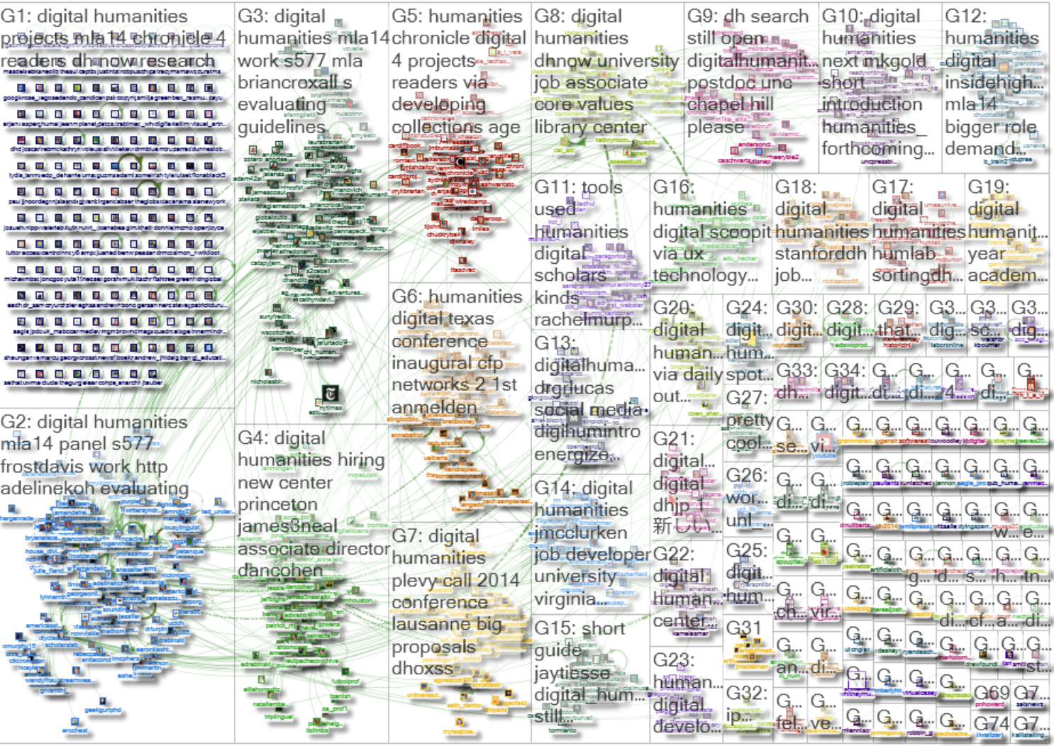
    Still, what I wanted was an impressionistic overview of the documents’ association with all of the topics. The first 40 or so attempts at this process were a dismal failure.  Partly because it was a learning process and partly because the results frequently resembled the much maligned “hairball,” what I produced was completely incomprehensible.  However, August 20th to 24th I attended the NSF, Social Media Research Foundation, and Grand funded Summer Social Webshop on Technology-Mediated Social Participation.  There, I met Marc Smith, who began developing NodeXL, a social media network analysis tool built to work with Microsoft Excel, while he worked for Microsoft Research.  Marc, who now leads the Social Media Research Foundation and Connected Action  generously took time to demonstrate how to import my topic modeling data into NodeXL so that I could generate graphs that are more elegant and streamlined than any I’ve been able to produce to this point.  The results aren’t just beautiful: they’re useful.

    So, what are those results? They include unimodal and bimodal network graphs that visualize connections between documents with other documents, topics with other topics, and documents with topics created with an LDA model in MALLET.  Using NodeXL’s algorithms, I am able to cluster groups with stronger ties in grid areas, assign them unique colors, and demonstrate the degree of probability the model calculates as a connection between nodes (either documents or topics depending on the graph).  The real power of NodeXL, though, is that in the future I can make my data public through the NodeXL gallery, and you can download my network graph and play with it yourself.  The data isn’t quite there yet, but that’s what’s coming.

    In the meantime, I’ll offer the following image of a network graph that I had hoped to produce with my earlier post about The Gazer’s Spirit.  Though the topic label is small, Topic 3 can be seen in the top left hand corner of the network diagram. The width and color of the edges in the diagram (meaning the width of the lines) is determined by the model’s estimation of how much of each topic is in each poem.  If the lines are thicker and lighter, it means that the model estimates that a large portion of the poem draws its language from the corresponding topic.  Similarly, the thinner and darker a line is the lower the probability that the poem includes language from the corresponding topic.

    Table 1: Ekphrastic Dataset – 276 poems and 15 topics

                Topic 3 (in the top, left-hand corner) is primarily comprised of connections to poems from The Gazer’s Spirit and is affiliated by language that reflects a kind of courtship, including archaic references (thy, thee, thou) and the language of love (er, beauty, grace, eyes, heaven, divine, hand, love).  This makes sense in the context of existing knowledge about Hollander’s volume.  The collection reads very much like a tribute to painting and the visual arts by poetry, and the language of desire is prevalent throughout.  Moreover, both W.J.T. Mitchell and James A.W. Heffernan, two prominent theorists in the ekphrastic tradition, insist that the language of love and desire is a strong, if not dominant, discourse across all of ekphrasis based on a canon of poems mostly included in The Gazer’s Spirit.  One might assume, then, that there would be strong connections between a topic comprised of the language of courtship, love, and desire and most of the poems in the collection; however, only a few of the poems with a statistically significant portion of its language from Topic 3 are not also in The Gazer’s Spirit: “The Picture of Little T.C. in a Prospect of Flowers,” “The Art of Poetry [excerpt],” “Ozymandius,” “Canto I,” and “My Last Duchess.”  Of those poems, none are by female poets.

    Poems with highest proportion of Topic 3
    The Temeraire (Supposed to Have Been Suggested to an Englishman of the Old Order by the Flight of the Monitor and Merrimac) by Herman Melville
    To my Worthy Friend Mr. Peter Lilly: on that Excellent Picture of His majesty, and the Duke of York, drawne by him at Hampton-Court by Sir Richard Lovelace
    From The Testament of Beauty, Book III by Robert Bridges
    For Spring By Sandro Botticelli (In the Academia of Florence) by Dante Gabriel Rosetti
    To the Statue on the Capitol: Looking Eastward at Dawn by John James Piatt
    The Poem of Jacobus Sadoletus on the Statue of Laocoon by Jacobus Sadoleto
    To the Fragment of a Statue of Hercules, Commonly Called the Torso by Samuel Rogers
    The Last of England by Ford Maddox Brown
    On the Group of the Three Angels Before the Tent of Abraham, by Rafaelle, in the Vatican by Washington Allston
    Death’s Valley To accompany a picture; by request.  “The Valley of the Shadow of Death,” from the painting by George Inness by Walt Whitman
    Elegiac Stanzas Suggested by a Picture of Peele Castle, in a Storm, Painted by Sir George Beaumont by William Wordsworth
    On the Medusa of Leonardo da Vinci in the Florentine Gallery by Percy B. Shelley
    The Mind of the Frontispiece to a Book by Ben Jonson
    Venus de Milo by Charles-Rene Marie Leconte de Lisle
    The City of Dreadful Night by James Thomson
    Sonnet by Pietro Aretino
    For “Our Lady of the Rocks” By Leonardo da Vinci by Dante Gabriel Rosetti
    Mona Lisa by Edith Wharton
    Ode on a Grecian Urn by John Keats
    The National Painting by Joseph Rodman Drake
    The “Moses” of Michael Angelo by Robert Browning
    Hiram Powers’ Greek Slave by Elizabeth Barrett Browning
    From Childe Harold’s Pilgrimage, canto 4 by George Byron Gordon
    The Picture of Little T. C. in a Prospect of Flowers by Andrew Marvell
    Before the Mirror (Verses written under a Picture)Inscribed to J. A. Whistler by Algernon Charles Swinburne
    For Venetian Pastoral By Giorgone (In the Louvre) by Dante Gabriel Rosetti
    The Art of Poetry [excerpt] by Nicolas Boileau-Despreaux
    Ozymandias by Percy B. Shelley
    The Iliad, Book XVIII, [The Shield of Achilles] by Homer
    Canto I by Dante Alighieri
    The Hunter in the Snow by William Carlos Williams
    Tiepolo’s Hound by Derek Wallcot
    St. Eustace by Derek Mahon
    Three for the Mona Lisa by John Stone
    My Last Duchess by Robert Browning

    Table 2: Ekphrastic Dataset 15 Topic Model, Topic 3 Highlighted

     The only remaining topic which includes the word love fairly high in the key word distribution is Topic 4, which includes the following terms: portrait, monument, foreman, felt, woman, monuments, box, press, bacall, detail, young, thick, crimson, instrument, hotel, compartment, picked, cornell, Europe, lovers. As you can see from the network diagram below, none of the topics with high probabilities of containing Topic 3 are included in the Topic 4 distribution.

    Table 3: Ekphrastic Dataset 15 Topic Model, Topic 4 Highlighted

    Equally interesting, poems with the highest proportion of Topic 4 are also authored by female poets.  Certainly, more poems by men include significant proportions of Topic 4 than poems by women that include significant portions of Topic three; however, there are striking and salient points to be made about the contrasting networks:

    Poems with highest proportion of Topic 4
    “Utopia Parkway” after Joseph Cornell’s Penny Arcade Portrait of Lauren Bacall, 1945 – 46 by Linda Hull
    Canvas and Mirror by Evie Shockley
    Portrait of Madame Monet on Her Deathbed by Mary Rose O’Reilley
    Internal Monument by G. C. Waldrup
    The Uses of Distortion by Caroline Crumpacker
    Joseph Cornell, with Box by Michael Dumanis  
    Drawing Wildflowers by Jorie Graham
    The Eye Like a Strange Balloon Mounts Toward Infinity by Mary Jo Bang
    Visiting the Wise Men in Cologne by J.P. White
    Rhyme by Robert Pinksy
    The Street by Stephen Dobyns
    The Portrait by Stanley Kunitz
    “Picture of a 23-Year-Old Painted by His Friend of the Same Age, an Amateur” by C.P. Cavafy
    Portrait in Georgia by Jean Toomer
    For the Poem Paterson [1. Detail] William Carlos Williams
    The Dance by William Carlos Williams
    Late Self-Portrait by Rembrandt by Jane Hirshfield
    Sea Life in St. Mark’s Square by Mary O’Donnell
    Washington’s Monument, February, 1885 by Walt Whitman
    Still Life by Jorie Graham
    Still Life by Tony Hoagland
    The Family Photograph by Vona Groarke
    The Corn Harvest by William Carlos Williams
    Portrait of a Lady by T. S. Eliot
    Portrait d’une Femme by Ezra Pound

    This impressionistic overview of the ekphrastic dataset prompted through the exploration of a network graph of the relationships between topics and poems is a first step.  Enough, perhaps, to formulate a new hypothesis about the difference between “love” and “lovers” in ekphrastic poetry, or to lend further support to the growing sense that there is a much broader range of kinds of attraction and kinship—a range inclusive of both competitive and kindred discourses—than previous theorizations of the genre have taken into account.  The network visualization goes further than to suggest that there are two very different discourses regarding love and affection in ekphrastic verse, but even suggests possible poems to consider reading closely to see what those differences might be and if they are worth pursuing further.  Through the use of networked relationships between topics and documents, we begin with lists of poems in which the discourse of affinity, affection, and desire—as courtship or as partnership—can be further explored through close readings.

    Meeting Edward Tufte’s claim that evidence should be both beautiful and useful, the NodeXL network diagrams of LDA data are a step toward developing methods of evaluating and exploring models of figurative language that do not necessarily fit the same criteria for models of non-figurative texts.

    https://web.archive.org/web/20141022110849if_/https://apis.google.com/se/0/_/+1/fastbutton?usegapi=1&size=small&count=true&hl=en-US&origin=http%3A%2F%2Fwww.lisarhody.com&url=http%3A%2F%2Fwww.lisarhody.com%2Fekphrasis-as-an-lda-network-in-nodexl%2F&gsrc=3p&ic=1&jsh=m%3B%2F_%2Fscs%2Fapps-static%2F_%2Fjs%2Fk%3Doz.gapi.en_US.YCD9kJfkPqE.O%2Fm%3D__features__%2Fam%3DAQ%2Frt%3Dj%2Fd%3D1%2Ft%3Dzcms%2Frs%3DAGLTcCOBYQ9-hXMw8hB7CS8ORf4u_z9tzw#_methods=onPlusOne%2C_ready%2C_close%2C_open%2C_resizeMe%2C_renderstart%2Concircled%2Cdrefresh%2Cerefresh&id=I0_1413976134666&parent=http%3A%2F%2Fwww.lisarhody.com&pfname=&rpctoken=30279630

    Comments from 2012

    1.  Scott B. Weingart says: Great post as always! I am curious how you decided your cutoff for keeping the edges of “poems with a statistically significant portion of its language from” particular topics, and which edges you decided to throw out. Also, just a quick suggestion, making the stronger edges lighter rather than darker was visually confusing, maybe reverse that or change the color scheme somehow?Reply
    2.  lmrhody says:Scott,
      You ask a great question. In this case, there are several “trimmings” built into the process. In the first layer, the script that I use for converting the model into an Excel workbook with individual spreadsheets (one for document distributions, one for word distributions, one for word probability distributions, one for topic to topic symmetrized K-L Divergence, one for document to document symmetrized K-L divergence, and one for document to topic probabilities, among a few others) allows me to establish a threshold that the topic to document likely proportion must meet in order to be included in the spreadsheet. In this instance, that threshold was .1. In the portion of the post you’re referring to, I list all the documents with an estimated topic proportion greater than 10%. In this case, that’s 35 documents out of 276. That’s not to say that documents with lower proportions might not also render useful results, but I feel fairly confident that my top 35 are sound. In fact, the list is cut and paste almost directly from my spreadsheet, so the poems are listed in order of their probability score, from highest (.8) to lowest (.1). Same is true for Topic 4, meaning that the further down the list you go, the lower the proportion of the poem is estimated to come from that topic.Regarding the graph’s design, I agree. The difficulty is that if you switch the colors (dark blue=strong, light blue=weak) then you completely overwhelm the weaker ties, and they can no longer be seen. Though the weaker ties are… well… weaker, they aren’t insignificant. As I mentioned, proportions lower than .1 were trimmed out. Perhaps it would make more sense to use just one visual cue (either thickness of edge or color saturation)–however, that also limits the ability to read the graph. For someone who is color blind, the use of color alone would inhibit understanding the degree of relatedness. Similarly, having a single color with variations in thicknesses of the edge makes a much more difficult graph to read, especially if when you print it out in black and white you still want to be able to distinguish between ties that overlay with one another. Admittedly, yes, it does create a sense of sensory confusion, but I went with what I felt were the lesser of two evils in this case. HOWEVER, in my document to document graph where I’m able to do really interesting things with clustering algorithms (and I’m really excited about how well this has been working), the darker=stronger works better because the position of the documents is more forcefully determined by symmetric K-L divergence.At some point in the not too distant future, I plan to post some of these graphs on the NodeXL gallery site. If you download the free NodeXL plug-in/template and then download my network graphs, you can play around with it, too. I’m eager to see what other people can do with my graphs.Reply
      • Scott B. Weingart says:Thanks! This adds a lot to the original post; I definitely look forward to seeing where this goes. I asked about your network because I’ve recently been doing similar work, and Ted Underwood apparently has as well. We should all chat about it sometime.Reply
        •  lmrhody says:Will you be coming to the NEH-sponsored Topic Modeling Workshop in November? I’m going to be there. I don’t know if Ted Underwood will be there, but I hope so. Perhaps, we will have a chance to get together and talk–and maybe even find something to collaborate on–there. Thank you for your questions and your comments, which have been really helpful as I’m working on revisions.Reply
  • Why use visualizations to study poetry?

    Why use visualizations to study poetry?

    This post was a DHNow Editor’s Choice selection on May 1, 2012.

    The research I am doing presently uses visualizations to show latent patterns that may be detected in a set of poems using computational tools, such as topic modeling.  In particular, I’m looking at poetry that takes visual art as its subject, a genre called ekphrasis, in an attempt to distinguish the types of language poets tend to invoke when creating a verbal art that responds to a visual one.  Studying words’ relationships to images and then creating more images to represent those patterns calls to mind a longstanding contest between modes of representation—which one represents information “better”?  Since my research is dedicated to revealing the potential for collaborative and kindred relationships between modes of representation historically seen in competition with one another, using images to further demonstrate patterns of language might be seen as counter-productive.  Why use images to make literary arguments? Do images tell us something “new” that words cannot?

    Without answering that question, I’d like instead to present an instance of when using images (visualizations of data) to “see” language led to an improved understanding of the kinds of questions we might ask and the types of answers we might want to look for that wouldn’t have been possible had we not seen them differently—through graphical array.

    Currently, I’m using a tool called MALLET to create a model of the possible “topics” found in a set of 276 ekphrastic poems.  There are already several excellent explanations of what topic modeling is and how it works (many thanks to Matt Jockers, Ted Underwood, and Scott Weingart who posted these explanations with humanists in mind), so I’m not going to spend time explaining what the tool does here; however, I will say that working with a set of 276 poems is atypical.  Topic modeling was designed to work on millions of words, and 276 poems doesn’t even come close; however, part of the project has been to determine a threshold at which we can get meaningful results from a small dataset.  So, this particular experiment is playing with the lower thresholds of the tool’s usefulness.

    When you run a topic model (train-topics) in MALLET, you tell the program how many topics to create, and when the model runs, it can output a variety of results.  As part of the tinkering process, I’ve been working with the number of topics to have MALLET use in order to generate the model, and was just about to despair that the real tests I wanted to run wouldn’t be possible at 276 poems.  Perhaps it was just too few poems to find recognizable patterns.  For each topic assignment, MALLET assigns an ID number to the topic and “topic keys” as keywords for that topic.  Usually, when the topic model is working, the results are “readable” because they represent similar language.  MALLET would not call a topic “Sea,” for example, but might instead provide the following keywords:

    blue, water, waves, sea, surface, turn, green, ship, sail, sailor, drown

    The researcher would look at those terms and think, “Oh, clearly that’s a nautical/sea/sailing” topic, and dub it as such.  My results, however, on 15 topics over 276 poems were not readable in the same way.  For example, topic 3 included the following topic keys:

    3          0.04026           with self portrait him god how made shape give thing centuries image more world dread he lands down back protest shaped dream upon will rulers lords slave gazes hoe future

    I don’t blame you if you don’t see the pattern there.  I didn’t.  Except, well, knowing some of the poems in the set pretty well, I know that it put together “Landscape with the Fall of Icarus” by W.C. Williams with “The Poem of Jacobus Sadoletus on the Statue of Laocoon” with “The New Colossus” with “The Man with the Hoe Written after Seeing the Painting by Millet.”  I could see that we had lots of kinds of gods represented, farming, and statues, but that’s only because I knew the poems.  Without topic modeling, I might put this category together as a “masters” grouping, but it’s not likely.  Rather than look for connections, I was focused on the fact that the topic keys didn’t make a strong case for their being placed together, and other categories seemed similarly opaque.  However, just to be sure that I could, in fact, visualize results of future tests, I went ahead and imported the topic associations by file.  In other words, MALLET can also produce a file that lists each topic (0-14 in this case) with each file name in the dataset and a percentage.  The percentage represents the degree to which the topic is represented inside each file.  I imported the MALLET output of topics and files associated with them into Google Fusion Tables and created a dynamic bar graph that collects file-ids along the vertical axis and along the horizontal axis can be found the degree that the given topic (in this case topic 3) is present in the file.   As I clicked through each topic’s graph, I figured I was seeing results that demonstrated MALLET’s confusion, since the dataset was so small.  But then I saw this: [Below should be a Google Visualization.  You may need to “refresh” your browser page to see it.  If you still cannot see it, a static version of the file is visible here.]

    https://web.archive.org/web/20141022105827if_/https://www.google.com/fusiontables/embedviz?&containerId=gviz_canvas&q=select+col0%2C+col4+from+3650097+&qrs=where+col0+%3E%3D+&qre=+and+col0+%3C%3D+&qe=+limit+247&viz=GVIZ&t=BAR&width=500&height=500

    If the graph’s visualization is working, when you pass your mouse over the lines in the bar graph, the ones that are higher than 0.4, then the file-id number (a random number assigned during the course of preparing the data) appears.  Each of these files begin with the same prefix: GS.  In my dataset, that means that the files with the highest representation of topic 3 in them can all be found in John Hollander’s collection The Gazer’s Spirit.  This anthology is considered to be one of the most authoritative and diverse—beginning with classical ekphrasis all the way up to and including poems from the 1980s and 1990s.  I had expected, given the disparity in time periods, that the poems from this collection would be the most difficult to group together because the diction of the poems changes dramatically from the beginning of the volume to the end.  In other words, I would have expected the poems to blend with the other ekphrastic poems throughout the dataset more in terms of their similar diction than by anything else.  MALLET has no way of knowing that these files are included in the same anthology.  All of the bibliographical information about the poems has been stripped from the text being tested.  There has to be something else.  What something else might be requires another layer of interpretation.  I will need to return to the topic model to see if a similar pattern is present when I use  other numbers of topics—or if I include some non-ekphrastic poems to the set being tested—but seeing the affinity in language between the poems included in The Gazer’s Spirit in contrast to other ekphrastic poems proved useful.  Now, I’m not inclined to throw the whole test away, but instead to perform more tests to see if this pattern emerges again in other circumstances.  I’m not at square one. I’m at a square 2 that I didn’t expect.

    The visualization in the end didn’t produce “new knowledge.”  It isn’t hard to imagine that an editor would choose poems that construct a particular argument about what “best” represents a particular genre of poetry; however, if these poems did truly represent the diversity of ekphrastic verse, wouldn’t we see other poems also highly associated with a “Gazer’s Spirit topic”?  What makes these poems stand out so clearly from others of their kind?  Might their similarity mark a reason for why critics of the 90s and 2000s define the tropes, canons, and traditions of ekphrasis in a particular vein?  I’m now returning to the test and to the texts to see what answers might exist there that I and others have missed as close readers.  Could we, for instance, run an analysis that determines how closely other kinds of ekphrasis are associated with Gazer’s Spirit’s definition of ekphrasis?  Is it possible that poetry by male poets is more frequently associated with that strain of ekphrastic discourse than poetry by female poets?

    This particular visualization doesn’t make an “argument” in the way humanists are accustomed to making them.  It doesn’t necessarily produce anything wholly “new” that couldn’t have been discovered some other way; however, it did help this researcher get past a particular kind of blindness and helped me to see alternatives—to consider what has been missed along the way—and there is, and will be, something new in that.

  • Curating a Network of Wood and Would

    Curating a Network of Wood and Would

    In my current research, I argue that Elizabeth Bishop’s poem “The Monument” represents a more democratic attitude toward aesthetic objects than what we see from her contemporaries Robert Lowell and John Berryman.  Eschewing the “tutelary” relationship between poet as teacher and reader as student, Bishop offsets her own position of power as the artist-creator by including the voice of a resistant, reluctant onlooker whose interrogations about what it is they are supposed to be looking at position the reader as the monument’s curator, one who must select between descriptions, views, depth, and purposes for the monument.  The monument’s physical presence is brought into being collaboratively between the two speakers who create it’s shape and it’s potential and the reader who must parse and prioritize the verbal network of the poem.  Furthermore, Bishop, who started writing “The Monument” in her Key West notebooks (see Barbara Page) after just having read Wallace Stevens’ Owl’s Clover, enters into public discourse about the relevance of public monuments (and by extension art) in a social, political, and economic climate in which people are suffering, nations are warring, and the realities of daily life seem to negate the place and purpose of art.  Sounds familiar, no?

    Bishop responds by arguing that monuments (and painting, and poetry, and sculpture) are significant because they are sites of “commemoration”–an interesting word choice because the word “commemorate” requires communal activity.  Unlike her friend Robert Lowell who uses the bronze relief by August Saint-Gaudens in Boston Commons to establish historical connection and significance for himself as an artist, Bishop imagines the monument as evolving to purpose rather deriving from it.

    Visualizing the poem as a network demonstrates how the speakers’ relationship to one another builds out of their discursive description of the monument.  In the networks below, each speaker is related to the monument through questions and description (recorded as the statements they make in the poem).  I have characterized those statements as grounding the monument in physical space, with tangible attributes, insisting on its materiality [repesented by blue lines] or on the other hand imagining the monument’s potential or possibility through questions, equivalences (is it this or that statements) and statements that intimate a metaphysical presence for the monument [in orange].

    <<image lost>>

    The networks are formed by matching each speaker up with with each statement made in the poem.  As a result, this is a “bimodal” network: one which takes actors and text and studies the relationship between them.  The relationship, represented by a line is further characterized as advancing the monument’s status as “wood” (a physical object belonging to the material, and therefore “real” world) and the word’s homophone “would” (a representation of possibility, potential, and by association the “imaginary” life of the mind).

    The reader as curator, then, must choose among the wood and the would–between the multiply rendered descriptions of the monument’s physical presence and its imagined potential, which is a new beginning itself, the shape of which could be poetry, painting, statue or monument, depending on choices the reader makes.

    Monument as Descriptive Network
  • Small Projects & Limited Datasets

    Small Projects & Limited Datasets

    I’ve been thinking a lot lately about the significance of small projects in an increasingly large-scale DH environment.  We seem almost inherently to know the value of “big data:” scale changes the name of the game.  Still, what about the smaller universes of projects with minimal budgets, fewer collaborators, and limited scopes, which also have large ambitions about what can be done using the digital resources we have on hand?  Rather than detracting from the import of big data projects, I, like Natalie Houston, am wondering what small projects offer the field and whether those potential outcomes are relevant and useful both in and of themselves as well as beneficial to large-scale projects, such as in fine-tuning initial results.

    My project in its current iteration involves a limited dataset of about 4500 poems and challenges rudimentary assumptions about a particular genre of poetry called ekphrasis—poems regarding the visual arts.  It is the capstone project to a dissertation in which I use the methods of social network analysis to explore socially-inscribed relationships between visual and verbal media and in which the results of my analysis are rendered visually to demonstrate the versatility and flexibility available to female poets writing ekphrastic poetry. My MITH project concludes my dissertation by demonstrating that network analysis is one way of disrupting existing paradigms for understanding the social-signification of ekphrastic poetry, but there are more methods available through computational tools such as text modeling, word frequency analysis, and classification that might also be useful.

    To this end, I’ve begun by asking three modest questions about ekphrastic poetry using a machine learning application called MALLET:

    1.) Could a computer learn to differentiate between ekphrastic poems by male and female poets?  In “Ekphrasis and the Other,” W.J.T. Mitchell argues that were we to read ekphrastic poems by women as opposed to ekphrastic poetry by men, that we might find a very different relationship between the active, speaking poetic voice and the passive, silent work of art—a dynamic which informs our primary understanding of how ekphrastic poetry operates.  Were this true and were the difference to occur within recurring topics and language use, a computer might be trained to recognize patterns more likely to co-occur in poetry by men or by women.

    2.) Will topic modeling of ekphrastic texts pick out “stillness” as one of the most common topics in the genre?  Much of the definition of ekphrasis revolves around the language of stillness: poetic texts, it has been argued, contemplate the stillness and muteness of the image with which it is engaged.  Stillness, metaphorically linked to muteness, breathlessness, and death, provides one of the most powerful rationales for an understanding how words and images relate to one another within the ut pictura poesis tradition—usually seen as an hostile encounter between rival forms of representation.  The argument to this point has been made largely on critical interpretations enacted through close readings of a limited number of texts.  Would a computer designed to recognize co-occurrences of words and assign those words to a “topic” based on the probability they would occur together also reveal a similar affiliation between stillness and death, muteness, even femininity?

    3.) Would a computer be able to ascertain stylistic and semantic differences between ekphrastic and non-ekphrastic texts and reliably classify them according to whether or not the subject of the poem is an aesthetic object or not?  We tend to believe that there are no real differences between how we describe the natural world as opposed to how we describe visual representations of the natural world.  We base this assumption on human, interpretive, close readings of  poetic texts; however, there is the potential that a computer might recognize subtle differences as statistically significant when considering hundreds of poems at a time.  If a classification program such as Mallet could reliably categorize texts according to ekphrastic and non-ekphrastic, it is possible that we have missed something along the way.

    In general, these are small questions constructed in such a way that there is a reasonable likelihood that we may get useful results.  (I purposefully choose the word results instead of answers, because none of these would be answers.  Instead the result of each study is designed to turn critics back to the texts with new questions.)  And yet, how do we distinguish between useful results and something else?  How do we know if it worked?  Lots of money is spent trying to answer this question about big data, but what about these small and mid-sized data sets?  Is there a threshold for how much data we need to be accurate and trustworthy?  Can we actually develop standards for how much data we need to ask particular kinds of humanities questions to make relevant discoveries?  In part, my project also addresses these questions, because otherwise, I can’t make convincing arguments about the humanities questions I’m asking.

    Small projects (even mid-sized projects with mid-sized datasets) offer the promise of richly encoded data that can be tested, reorganized, and applied flexibly to a variety of contexts without potentially becoming the entirety of a project director’s career.  The space between close, highly-supervised readings and distant, unsupervised analysis remains wide open as a field of study, and yet its potential value as a manageable, not wholly consuming, and reproducible option make it worth seriously considering.  What exactly can be accomplished by small and mid-scale projects is largely unknown, but it may well be that small and mid-sized projects are where many scholars will find the most satisfying and useful results.

  • Preparing texts for network visualization

    Preparing texts for network visualization

    When I presented at MSA 13 earlier this month, I was unsatisfied with my methods for creating network visualizations of texts.  I knew that preprocessing automatically would not work yet, since I have yet to identify precisely how I want to designate nodes across larger bodies of poems.  What I’ve been looking for is a way to mark texts up descriptively, using some form of markup language (XML, TEI), that would be uniform enough to render data that could be meaningfully displayed, and then to find a visualization software package with an algorithm that would “work” the way I wanted it to.  The problem, of course, is that when you’re a rogue DH scholar out in the world borrowing tools and using whatever tends to fall your way, then you’re not going to be sure about how each tool works (unless you have a CS or social science degree that includes learning about network algorithms, which I do not have), and this is going to detract from the validity of how and what you say about your object of study.  On the flip side, tools and text analysis software are becoming more widely available, and so doing what I’ve done, which is to say Googled “discourse network tool” and finding Philip Leifield’s “Discourse Network Analyzer” is actually possible.  What is remarkable about how DNA, a GUI text processing software, works is that it is designed as an interpretive tool to mark texts up in XML so that they can be displayed using free network visualizing software such as Visone, Ucinet, or Netdraw.  The designed purpose of Leifield’s DNA software is to collect articles on a topic area and to use those articles to create network visualizations of agreement and disagreement between individuals and groups.  For example, the sample dataset used for a tutorial on the software comes from someone at the University of Maryland named Dana R. Fischer, (I have no idea who she is… but I’m definitely going to look her up!) who marked up articles, testimony, and other texts about climate change.  Essentially, she could input each text into the DNA software and create a basic XML document with very minimal encoding (document type, author, dates, title) and then use DMA to select portions of text that create a “statement” about climate change.  By tagging the speaker, the organization the speaker is affiliated with, and the content type –a restricted list of terms created by the user to describe the topic being discussed—as well as whether or not the speaker agreed or disagreed with the topic) she could create networks of statements made about climate change that also included the individuals involved in the climate change debate and their organizations.  Such a visualization helps us to understand how much any one group (say, the Senate and the EPA) agree with one another, to identify the issues on which they agree and disagree, and to also understand affiliations (which speakers are affiliated with which climate change debates).

    This isn’t *exactly* what I had in mind, but it’s really darn close.  The power of this particular piece of software is that I can be in charge of what constitutes an article (a poem), what constitutes a speaker (the poetic speaker, the author, the third person omniscient… all of them), and the “content” to be described.  Granted the “organization” classification is less helpful to me, but in the instance of “The Venus Hottentot (1825)” I could differentiate between speakers from the first section of the poem from the second using this feature.  Using the software this way does not begin to utilize it’s real power, which is to read topics and speakers over large corpuses of texts in similar ways.  For now, I’m looking at one poem; however, I could see in the future were I to take this poem and situate it in a larger public discourse about black female subjectivity, I could.  I could import, for example, Sander Gilman’s article “Black Bodies, White Bodies: Toward an Iconography of Female Sexuality in Late Nineteenth-Century Art, Medicine, and Literature,” which we know Elizabeth Alexander read before writing the poem.  We could also bring in articles by Sadiah Quershi on “Displaying Sara Baartman” or Terri Francis’s “I and I: Elizabeth Alexander’s Collective First-Person Voice, the Witness and the Lure of Amnesia,” or chapters from Deborah Willis’s Hottentot Venus 2010 and demonstrate how Alexander’s poem participates in a larger act of social recovery.

    There are, as with any tool, limitations, though.  So far, the only way to create the visualizations is using the speakers, organizations, and categories with directional lines indicating agreement or disagreement.  I have not found a way of creating networks of “statements.”  In other words, I have not found a way to pull a category and then visualize the network of statements about that category and how they relate to each speaker; however, I have only begun the process of creating visualizations.  Another complication is that I have only found ways to make a statement associated with one category.  I’m fairly certain I can find a work around for that, but for the moment, that’s not worked out; however, I will say that having to choose between regular category designations (ones of my own creation) did make me very attuned to my assumptions about the text.  That process helped me to realize how my visualizations of these networks will always be limited and remind me that I need to make those limitations transparent when I write about what the visualization actually visualizes.

    In the meantime, even though I am not teaching right now, I’m really excited about what this kind of software could mean for my students.  In the English 101 courses at the University of Maryland, students write three linked assignment papers on a self-selected research topics.  These are position papers, where the student must make purposeful arguments for what he or she believes in and respond to the discourse of the field in which their selected debate is ongoing.  We generally assign an annotated bibliography as the first part of that linked assignment as a way of getting students to read the work and to then explain who agrees with each other on particular points and who disagrees.  The hard part of this assignment is that each entry is generally 2 paragraphs long and includes only 8-10 sources, and getting the students to actually compare arguments, identifying points of agreement and disagreement is difficult.  However, if the assignment were to use the Discourse Network Analyzer to import each article and then go through each article tagging “statements,” “speakers,” “organizations,” and “categories” (for example, are the speakers arguing that a particular action should be taken or that one event causes another…) as well as “agreement” or “disagreement” with that statement, they might begin to see how their readings create a network of ideas and by understanding who agrees and what they agree upon, the student might be better able to situate him or herself within the discourse of that issue.  It’s an intriguing idea to me, and at some point when I’m teaching again, I think I’m going to make use of this technology.